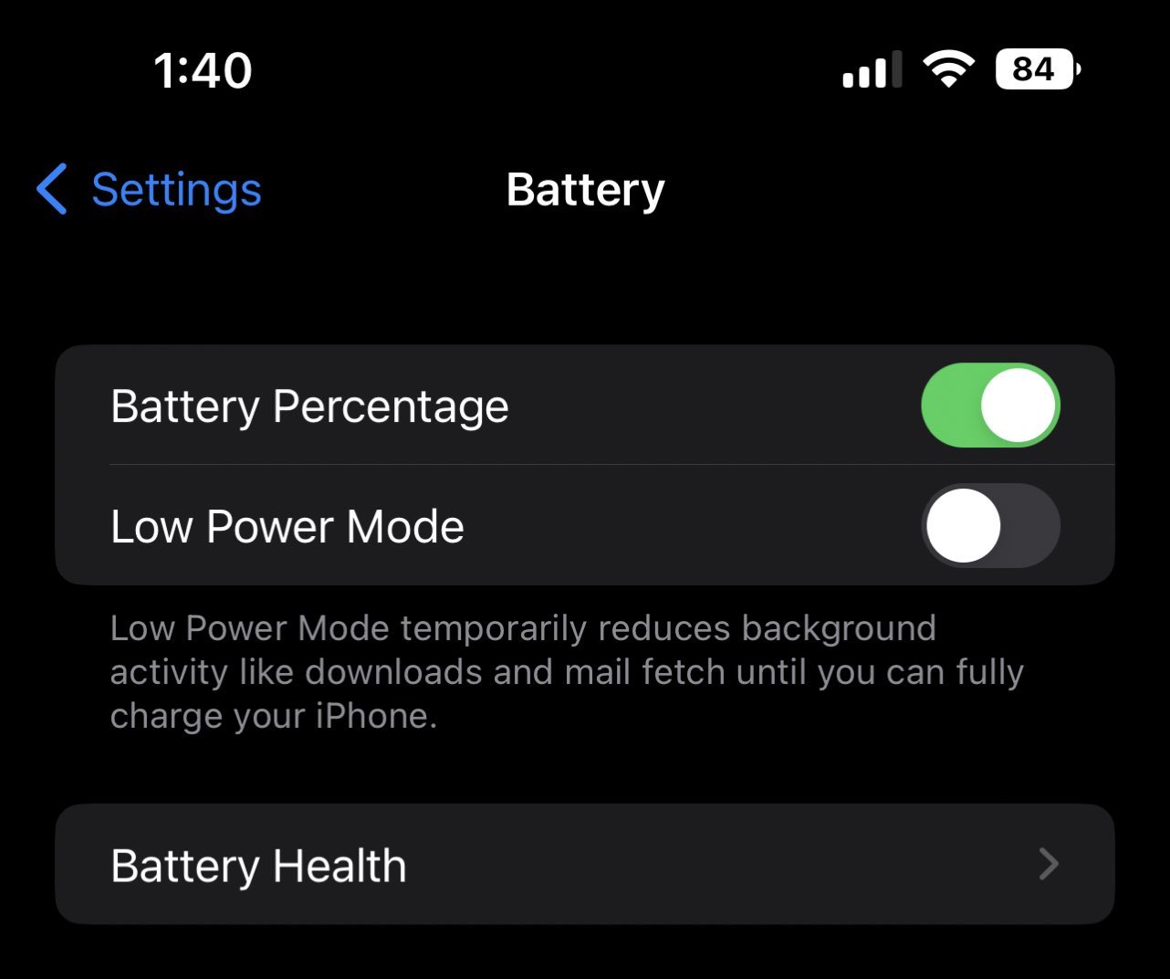
Of all the new features announced for iOS 16, we didn’t expect a new battery icon to be the one that made the most waves among the tech community. Apple’s new icon was quietly released with the most recent iOS beta – and while it’s great to see the remaining percentage on the home screen again, users aren’t thrilled with the execution.
The issue is that the battery icon no longer shows the juice depleting horizontally – instead, all users have to go on is the number plastered over the icon. For many, it’s proving confusing to see a combination of a full battery icon and a low number sitting on top of it. (Check out the best iPhone 13 deals if you’re in the market for new gear.)

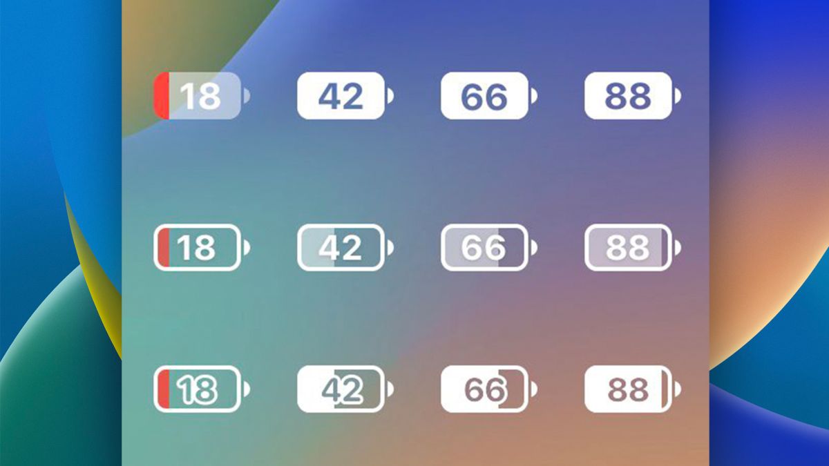
And design-savvy Apple fans have already taken it upon themselves to improve upon Apple’s offering. One particularly sound redesign comes from Brian Michel, engineering manager at The Browser Company (below). This envisions the color of the numbers changing from black to white with the movement of the battery status, making the whole thing much easier to read (and understand).
Just recreating the battery indicator pic.twitter.com/cK8PZDe9Y5August 9, 2022
But this isn’t the only option. Product manager Mikael Johansson has shared no less than three possible alternatives, featuring workarounds including borders around the numbers, and a light gray color for the battery icon itself.
Nothing wrong with what Apple released but I think I might’ve preferred something like Alternative A for the battery indicator pic.twitter.com/a44879RIFkAugust 10, 2022
It’ll be interesting to see whether Apple does indeed decide to tweak the icon before rolling out iOS 16 to the public in September – no doubt alongside the highly anticipated iPhone 14. Don’t fancy waiting? Take a look at today’s best iPhone 13 deals below.
Readmore:
