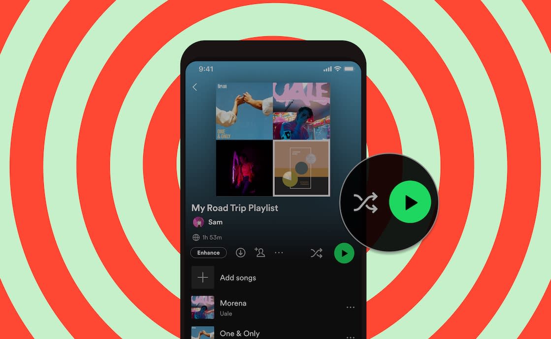
Spotify is updating its app to address a long-standing user complaint with music playback — but it’s asking customers to pay for the fix. The company announced today it will introduce, at last, a separate Play Button and a Shuffle Button at the top of albums playlists to make it easier to play the music the way you like. This will replace the combined button available before, which had been inconsistent across platforms and frustrating to use. However, streamers may be disappointed to find out that what should be an app update in favor of better usability is oddly being sold to them as a reason to upgrade to Spotify’s paid tier — the company says the new button is only being offered to Spotify Premium subscribers.
This seems a bizarre choice given that customer complaints had correctly identified an issue with the overall design of the Spotify app’s interface and its user experience. As one review posted last year to Spotify’s Community forums had noted, the button offered was even different across Spotify’s apps. On mobile, playlists had the combined Shuffle/Play button, but on the desktop, the button was just a regular Play Button. This was confusing for users who switched between platforms, the post pointed out. The user suggested Spotify simply offer two separate buttons so people could choose how they wanted to stream music, instead of having to tap into Now Playing screen to enable or disable Shuffle mode.
The post received 647 upvotes and pages of comments from others who agreed. It was not the only complaint of this nature on the forum site. Others posted similar requests for separate Play and Shuffle buttons or even different solutions to the same problem. For example, one person asked Spotify to allow users to configure which button appeared in the app to make it a user’s choice.
Spotify has been working on this problem for awhile. It first introduced the Shuffle/Play icon in 2020 to reduce streaming to just a click, it said, and last year made Play Button the default button on all albums for Spotify Premium users (at Adele’s request, as you may recall). With this upgrade, the Play Button will remain the default, and Shuffle will be a separate option across the mobile Spotify experience.
While arguably a minor change to the app — it’s literally just a button — it’s clearly a feature that was in need of a fix in users’ minds not a premium offering. Other major music streaming apps, like Apple Music and Amazon Music, already include separate Play and Shuffle buttons, for instance.
It’s uncommon for app makers to charge for something like a different button, especially when the reason for the change is because users were unhappy with the app’s functionality and design. One somewhat related example could be Twitter’s subscription service, Twitter Blue, which allows users to customize the bottom bar of the app with buttons of their choosing. But in that case, the option is more about personal preference and quick access to favorite features — not usability. Even without paying, Twitter’s features are still easy to get to in the main navigation on the left side of the app.
Spotify tells us the idea to charge for the button has to do with how it perceives the benefits associated with a Premium Subscription. At its core, Premium users are paying for the option to listen to any song they want, on-demand. The button is somewhat of an extension of that, as it’s allowing users to choose to listen on-demand in any way they want.
